Northwestern Mutual Connect
Defining a scaleable information architecture and navigation pattern for the financial advisor web platform.

At
Learnvest / Northwestern Mutual
When
2016
What
Responsive web ux
Information architecture
User research
Legacy system integration
Team
Design lead (me)
Design researcher
PM
Tech lead
—
How might we design a 5-year vision IA and scalable navigation system to simplify financial planner’s daily workflow by integrating multiple stand-alone apps into a single destination?
NM Connect was an existing web application used by Northwester Mutual (aka NM) financial advisor to review client insurance policies and generate reports for quarterly or yearly client meetings.
Soon this app needed to incorporate Learnvest’s financial planning tools, and I was tasked with figuring out how that might happen with as much future proofing as possible.
Process
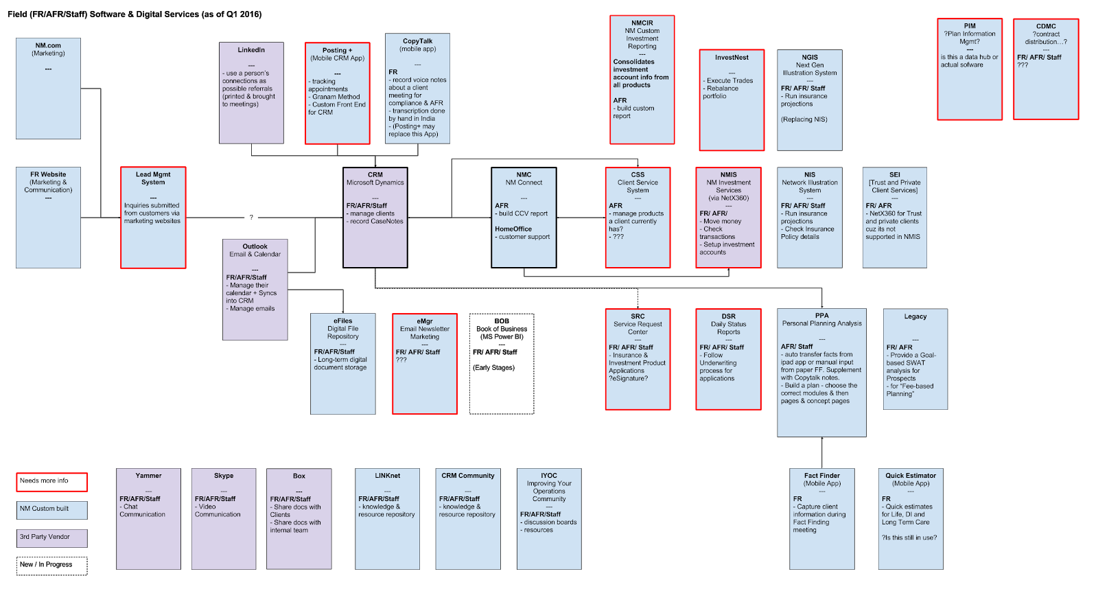
NM Connect (aka NMC) was just one of many apps and tools an NM financial advisor might use to run their business
1.
Understand Northwestern Mutual
Before we could start anything, the product manager and I had to gain a greater understanding about the company, how it worked with its financial advisors, and the tools it provided them.
We had many conversations with stakeholders and subject matter experts to give us glimpses into terminology and areas. Each conversation exposed us to new information and new questions. I crafted the diagram above as way to keep track of the various tools being mentioned.
The business knew that NM Connect was going to be the one area that would be extended to integrate Learnvest’s planning tools, and that raised the question “What else should be integrated?”.
Who uses NM connect?
There was a range of different roles that used the current software

~July 2015 to Jan 2016 unique visitors
FA = Financial advisor
AFR = Assistant financial advisor
NO = Network office (regional support)
HO = Home office
HO call center
The FA and AFR role used NM Connect to make sure insurance products were grouped correctly, and create Consolidated Client View reports (aka. CCV reports). These reports gave clients a complete picture of everything they had with NM.
NO, HO, and HO call center roles used NM Connect to look up clients and help with self-service questions from the client-facing website.

2.
Understand how NM insurance is structured
Next we had to learn how the company sold, structured, and organized its insurance policies (These were called products internally).
Diagram to illustrate how the different context are connected to insurance products
3.
Define challenges with the existing system
The existing header provided ways to find and navigate between primary context, change Households, custom product groups, or filter insurance products. It also provided access to managing their own access. In fact, some AFR worked for multiple FRs, and had to ability to change which FR they were working as. This impacted which clients, businesses, or trusts they could access
This breaks down into three areas.
Primary context controller (light grey row across the very top)
Contextual navigation (white row with NM logo)
Content area + household filter
There were some very clear areas to improve the way finding, visual hierarchy, and navigational relationships.
Deconstructing the primary context controller
In conversations with the tech lead and after technical investigation, he determined it would be impossible to continue supporting it as it was. It did way too many things, and it was also confusing for users to.
Search for client, business, or trust
Filter products by role (of the current client)
Filter custom groups (related to current client)
Client link toggle
Works for control
Logged in user
For me there was a confusing mix of finding and selecting a client and filtering the information of the selected client. My hypothesis was to change the structure, and break Search over to a separate screen. This would also provide a more clear starting point, and lay the groundwork for a book-of-business dashboard.
Search screen with a global nav focused on managing the user’s own account. The focus here was on the nav structure and less on layout of the Search screen itself.
Client screen with improved visual hierarchy and contextual navigation structure
4.
How might users access the secondary filters?
The above approach provided initial solutions for most of the controls, but was still missing a way to adjust product groupings within the selected client, trust, or business.
Filter products by role (of the current client)
Filter custom groups (related to current client)
Change households
After some sketching and conversations with my PM, I arrived at two concepts that might work.
Single mega menu filter
Separate person and product filters
I put together clickable-prototypes using the wireframes and then worked with a user researcher to run a few usability and validation sessions with AFRs and Home Office staff. We wanted to understand which direction aligned more closely with our user’s natural mental model.
Research indicated concept two with the separate menu’s was more clear and matched existing expectations for filtering the product and policy information.
Concept 1 - “Mega menu”
Concept 2 - “Separate menus”
5.
How might we organize content and tools for a single client?
Now that we had defined the high level structure and the controls for managing information, we needed to understand the scope of content and tools that might be provided within a client context.
To think big about the future, I organized a meeting with designers, product, stakeholders, and subject matter experts to brainstorm all tasks the different user’s might need to accomplish within this software. We used realtime board to keep our participants engaged across New York, Arizona, and Wisconsin.
Remote brainstorming and affinity mapping activities
Mental model activity and mapping
After some affinity diagraming into key groups, I continued organizing it down in to smaller groups using Indi Young’s mental model construct. This helped me devise three possible organizing models.
by Service Area - what point of the workflow is the user within?
by Objective - what activity is the user engaged in?
by Content - what information is the user looking for?

6
Which organizing model aligns with user’s expectations?
The product manager and I worked with a user research to develop a research plan to determine which organizing model aligned best with our current users. I developed a script and mapped out the possible answers to align with a Treejack test. This method would rely purely on the words and hierarchies without any interface.
There were very close results, but after examining each task, it was clear that the organizing model based on content types was the most effective.
The was almost no difference in success rate, but it was clear that org model 3 took was fastest for user’s to complete. This encouraged us to take a closer look at each task.
At the individual task level, organizing model 3 provided higher success rates with less clicking around. With these results, we choose to move forward with the organizing model based on around content types.
7
Finalizing the visual design and scaling back the IA.
Now that we had defined an organizing model for the content, I worked with the evolving design language being defined for NM by another designer to iterate on the overall design of the header.
I also needed to document what the information architecture might be in the future, and what it would look like when we built it out with the existing content.
Future state information architecture with final visual design for NM Connect. This provided a glimpse into how the tool’s top level structure might be extended to support other apps for meeting management, business insights, and workload alerts.
First iteration of the information architecture using existing content and tools.
Result
—
I simplified a complicated navigation system that had organically gotten more complex over time. The new header provided a clear orientation of the main context, clear ways to filter products, an organizing model aligned to use expectations, and set a foundation for future expansion.
I worked with the engineering team to change Learnvest’s planning tools header to align with this NM Connect future. This would facilitate an easier transition when that future connection happened. You can see more of this within my Learnvest casestudy